tl;dr
In this post, I produce a simple example of a choropleth map in R. I go over how to use the {sf} package to read in and display geographic boundaries from the ONS Open Geography Portal and show how we can make any static map interactive with {plotly}.
Everyone loves a map
Choropleth maps are an excellent data visualisation tool to show variation in some factor across different geographies. While there are multiple ways to produce such a map (and multiple packages to do so) in R, in this post I show my go-to approach to produce a choropleth map using UK geographic boundaries.
The process can be summarised by the following steps:
- Read in the data you want to display on a map
- Read in geographic boundaries
- Combine those into one dataframe/tibble
- Use {ggplot2} and {sf} to produce a choropleth map
- (Optional) Make this map interactive with {plotly}
Packages
Before doing anything else, we want to load the following packages:
- {tidyverse} to manipulate our data and visualise it using ggplot2
- {sf} is the package that deals with our geographic boundaries
- {viridis} for its beautiful and colourblind-friendly colour palette
- {plotly} to make our map interactive
library(tidyverse)
library(sf)
library(viridis)
library(plotly)
Step 1: Read in the data that will be displayed on a map
The data I want to map is the median age in each local authority in the UK, which can be found here. I’ve already loaded this data and stored it in a dataframe called age_data, which looks like this:
## # A tibble: 6 x 3
##   administrative_geography geography        median_age
##   <chr>                    <chr>                 <dbl>
## 1 E07000031                South Lakeland         51.3
## 2 K02000001                United Kingdom         40.3
## 3 W06000001                Isle of Anglesey       48.3
## 4 E07000178                Oxford                 28.9
## 5 E07000040                East Devon             51.2
## 6 E07000227                Horsham                46.3
My data includes standard geography codes for each local authority (called administrative_geography). This is important because we will need this variable later in Step 3 when we join our data to geographic boundaries data.
Step 2: Find and read in geographic boundaries
Next, we will want to get local authority boundaries from the ONS Open Geography Portal. The Open Geography Portal provides boundaries for a multitude of UK geographies. Here, we’re interested in local authority boundaries in 2020, which we can find here.1
The format we want to import geographic boundaries in is called ‘GeoJSON.’ This is a format that is specifically designed to encode geographic data structures. Getting this format from the ONS websitetakes a bit of navigating. From the page linked above, we click on “View Full Details.”
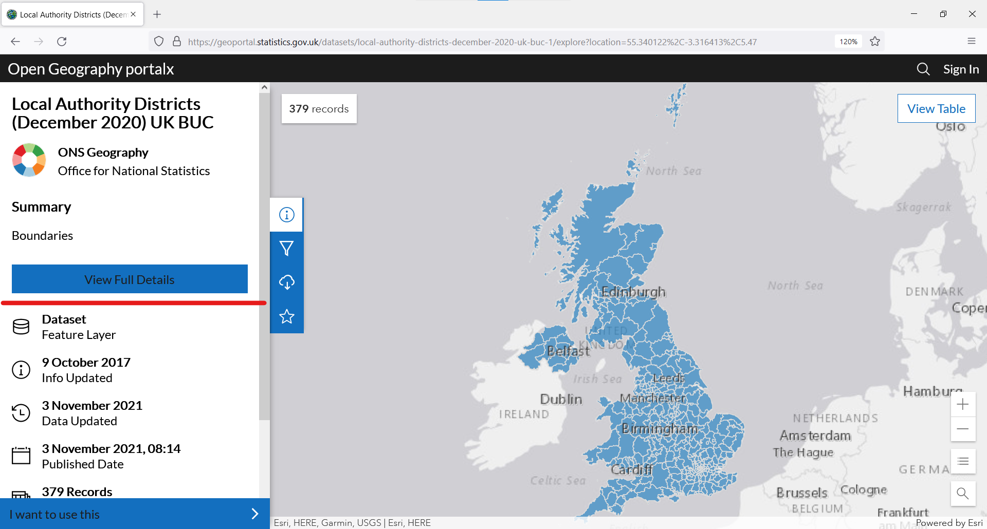
This will take us to a new page. On this new page, we scroll down to find the section “View API Resources” and copy the GeoJSON link.
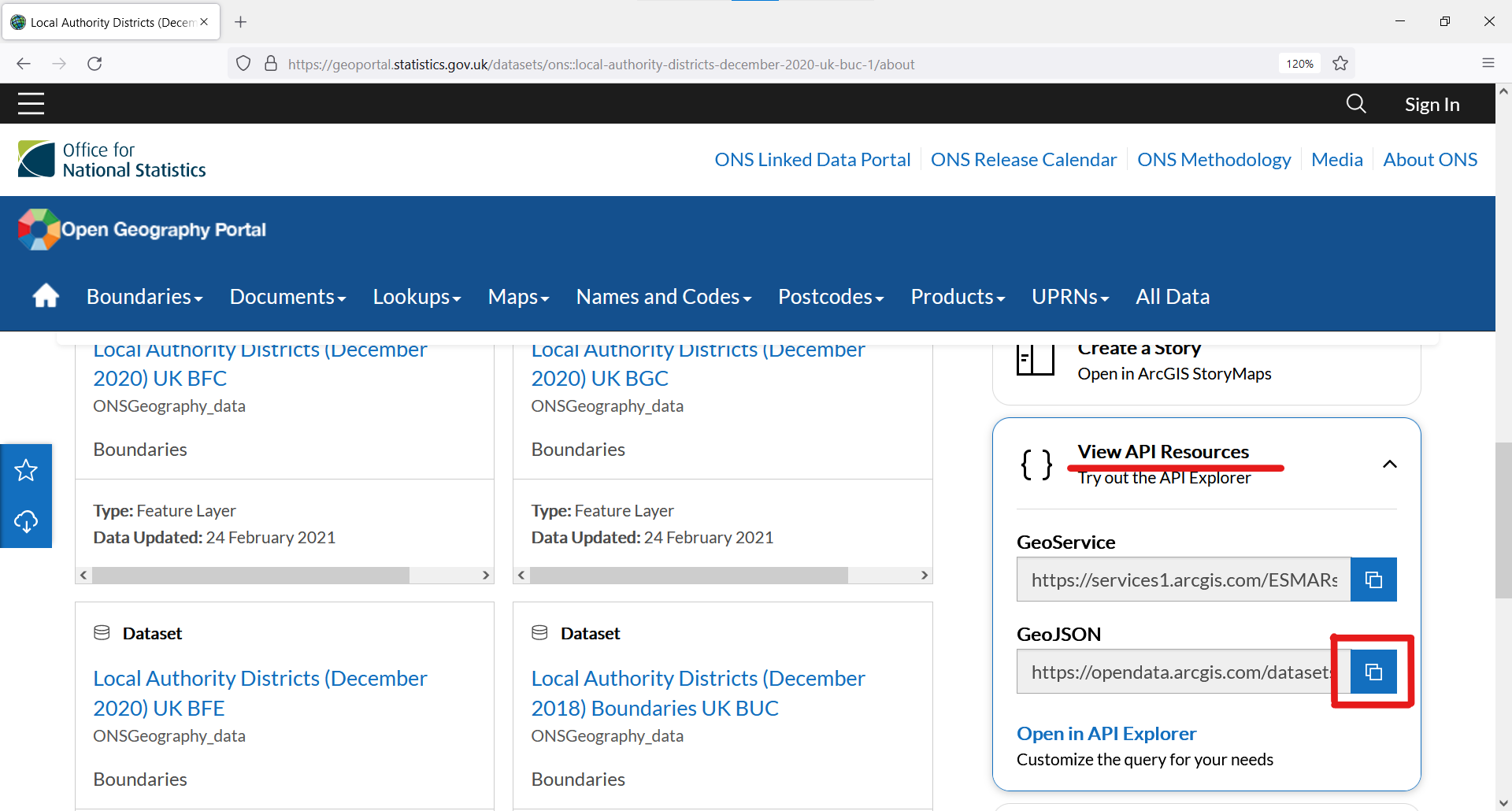
To load the geographic boundaries in R, we use this GeoJSON link as an argument of the read_sf() function, as shown below. The read_sf() function will do its job, which is to retrieve the information from the ONS website and import it into R.
GeoJSON_url <- "https://opendata.arcgis.com/datasets/69d8b52032024edf87561fb60fe07c85_0.geojson"

lad_boundaries_2020 <- read_sf(GeoJSON_url)
Our new object lad_boundaries_2020 contains geographic information on all local authorities in the UK, including their centroid latitude and longitude, as well as their geometry (how they should be drawn on a map).
## Simple feature collection with 6 features and 8 fields
## Geometry type: MULTIPOLYGON
## Dimension:     XY
## Bounding box:  xmin: -2.832457 ymin: 53.30503 xmax: -0.7918913 ymax: 54.72717
## Geodetic CRS:  WGS 84
## # A tibble: 6 x 9
##   LAD20CD   LAD20NM     LAT  LONG                         geometry  BNG_E  BNG_N
##   <chr>     <chr>     <dbl> <dbl>               <MULTIPOLYGON [°]>  <int>  <int>
## 1 E06000001 Hartlepo~  54.7 -1.27 (((-1.24224 54.72297, -1.241935~ 447160 531474
## 2 E06000002 Middlesb~  54.5 -1.21 (((-1.198604 54.58287, -1.16664~ 451141 516887
## 3 E06000003 Redcar a~  54.6 -1.01 (((-0.7918913 54.55824, -0.8004~ 464361 519597
## 4 E06000004 Stockton~  54.6 -1.31 (((-1.19319 54.62905, -1.200175~ 444940 518183
## 5 E06000005 Darlingt~  54.5 -1.57 (((-1.438355 54.59508, -1.42332~ 428029 515648
## 6 E06000006 Halton     53.3 -2.69 (((-2.690633 53.38539, -2.69090~ 354246 382146
## # ... with 2 more variables: SHAPE_Length <dbl>, SHAPE_Area <dbl>
Step 3: Combine our data into one dataframe/tibble
We then combine the data we want to map with geographic boundaries for all local authorities. We do this by joining age_data onto lad_boundaries_2020, using standard local authority codes as the variable to join these 2 datasets by.
combined_data <- lad_boundaries_2020 %>%
  left_join(age_data,
            by = c("LAD20CD" = "administrative_geography"))
Step 4: It’s mapping time!
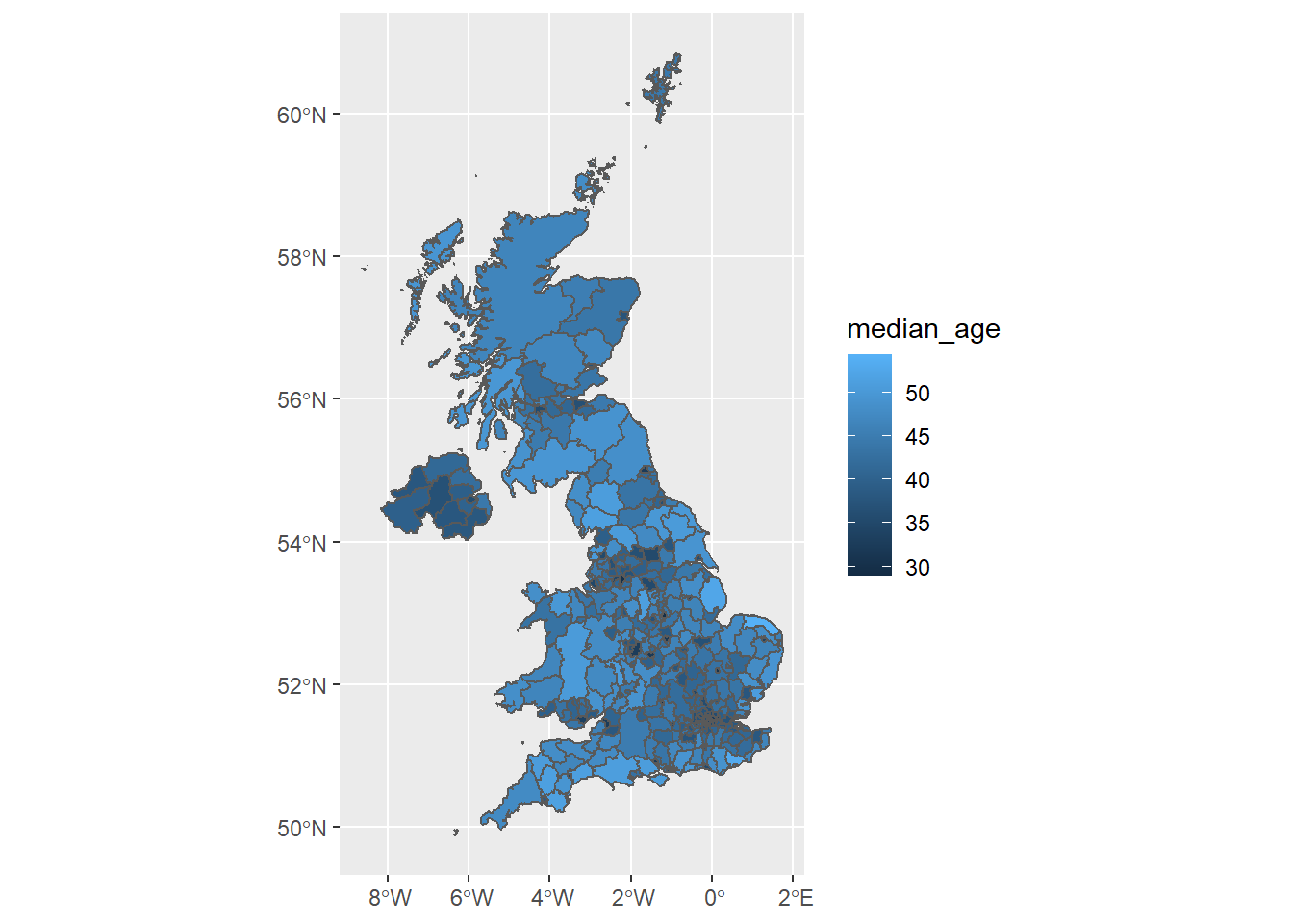
We can now use standard {ggplot2} syntax to produce our map! The code below shows how to produce the simplest choropleth map. We use the fill aesthetic to change the colour of each local authority based on the median_age of the people who live there.
simple_choro_map <- combined_data %>%
  ggplot(aes(fill = median_age)) + # create a ggplot object and
  # change its fill colour according to median_age
  geom_sf() # plot all local authority geometries

simple_choro_map
Everyone loves a pretty map
OK, we have a choropleth map. But I think you’ll agree that it’s not yet the clearest map. Personally, I think:
- The colour scale makes it difficult to differentiate between local authorities with a high/low median age
- The outlines of each local authority make it difficult to see what’s happening in regions where there are many small local authorities (e.g. London)
- The background grid and axes aren’t necessary and they distract me from looking at what’s important - the map!
Let’s make a few visual tweaks…
pretty_choro_map <- combined_data %>%
  ggplot(aes(fill = median_age,
             text = str_c(LAD20NM, ": ", median_age) # (Optional:
             # this addition is not used for a static map but will
             # be useful in the next section when we make our map
             # interactive)
             )
         ) +
  geom_sf(colour = NA) + # Adding 'colour = NA' removes boundaries
  # around each LA
  scale_fill_viridis("Median age") + # Changes our colour scale to
  # viridis and prettifies our fill title in the legend
  theme_void() # removes unnecessary background grid and axes

pretty_choro_map
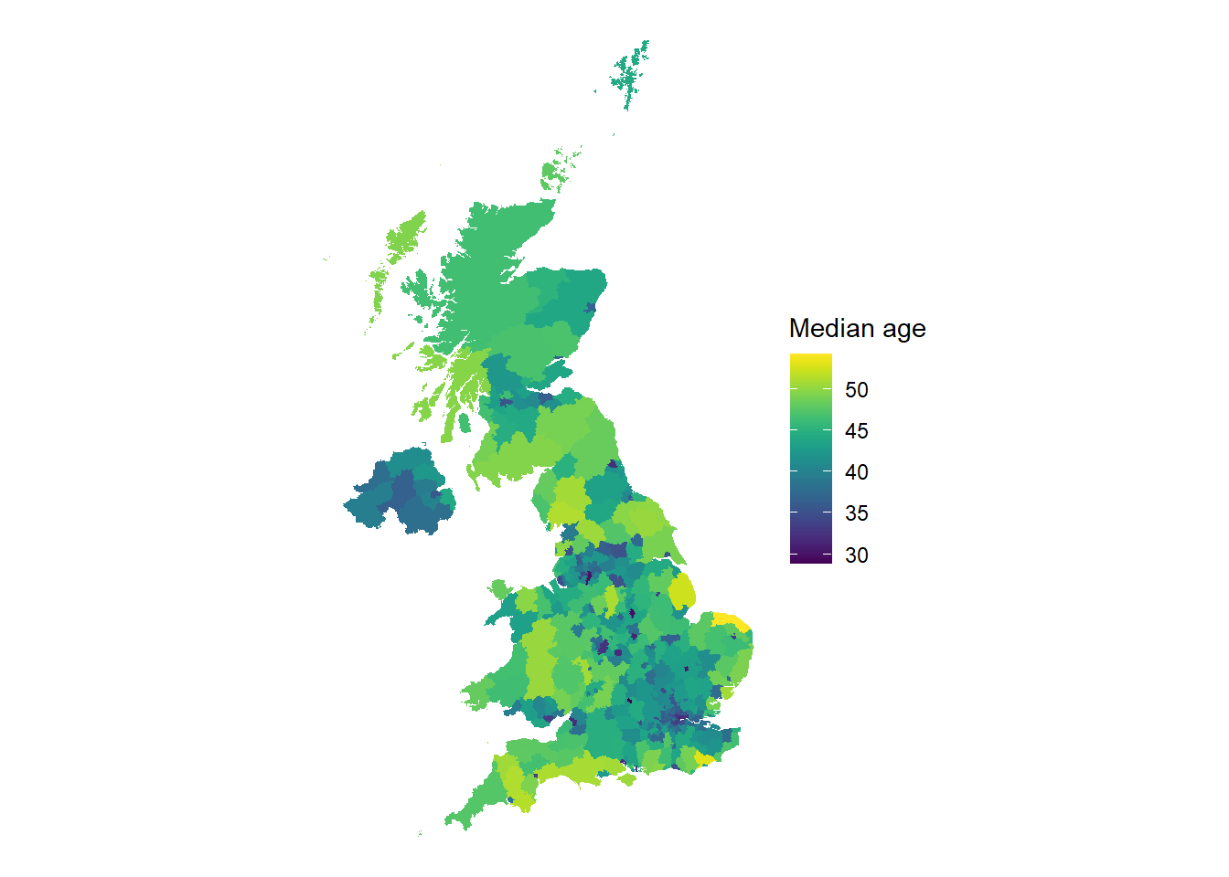
Better? Definitely! And there we have it, a pretty static choropleth map made in R using {sf} and {ggplot2}.
Depending on your use case for this map, you may even wish to add to it in different ways. For example, you may want to zoom in on what’s happening in a specific region; highlight the areas with particularly high median age by colouring their boundaries red; or plot the location of particular services (e.g. care homes). Although we won’t go through these adjustments in this post, these adjustments are all possible using {ggplot2} and other packages. If you can think it, it can usually be done.
Everyone loves a pretty interactive map
Optionally, we could even go one step further from a static map and make our choropleth map interactive. This means we’ll be able to engage with it by hovering, zooming in, etc.
Thankfully, the {plotly} package makes it straightforward to transform any static chart produced with ggplot() into an interactive chart. All we need to do is wrap our static map into the ggplotly() function and add any visual tweaks we want (such as specifying which information we want to see when we hover over a local authority).2
interactive_map <- ggplotly(pretty_choro_map, # wrap static map in
                            # ggplotly()
                            tooltip = "text" # (Optional: set the
                            # text aesthetic to be what we see
                            # when we hover over a local auth.)
                            )

interactive_map
-
Note: ONS boundaries typically come in 4 different versions (BFE, BFC, BGC and BUC). These differ primarily in their resolution/how granular they are. If you’re not sure which version to use, I’d generally start with BUC, as it’s the lowest resolution and so will be quicker to read in/manipulate. ↩︎
-
meta: thanks to JLaw for showing how to include plotly charts without massively inflating this blog post’s reading timer! ↩︎